
Design system
Pamikyx Style Guide
A living reference for the brand — colours, typography, components and form states. British English, WCAG AA contrast, 8px spacing rhythm.
Colour
Teal 600 (primary)
Teal 800
Teal 50
Gold 400 (accent)
Gold 50
Rose 500 (support)
Cream (bg)
Charcoal (text)
Typography
Eyebrow · Fraunces / Inter
Heading 1 — Fraunces serif
Heading 2 — dignified, warm
Heading 3
Body copy is set in Inter at a comfortable 17px with generous line height for older readers. The tone is warm, plain and reassuring — never clinical or cold. Colour, organise, recognise: British English throughout.
A text linkButtons
Cards
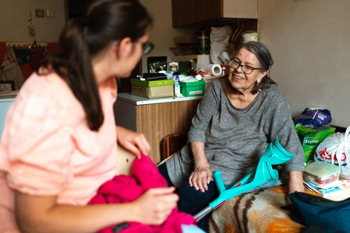
Companionship Care
Friendly, regular company at home — conversation, hobbies, outings and a caring eye on wellbeing.
Learn more
Palliative Care
Compassionate end-of-life and palliative support focused on comfort, dignity and precious time with family.
Learn moreCQC Registered — a care provider you can verify
Pamikyx Ltd is a CQC-registered care provider. Verify us on the CQC register.
Form states
Please enter a valid email